Checking Out With Transparency
Our challenge was to build the smoothest and most trustworthy experience to send flowers online. We ended up creating one of the most popular floral brands in the country, processing nearly $2m in monthly revenue with a 12% conversion rate.
Client
UrbanStems
Role
UX/UI, Frontend, Cofounder
Technology
React, HTML, CSS, JS
The Opportunity
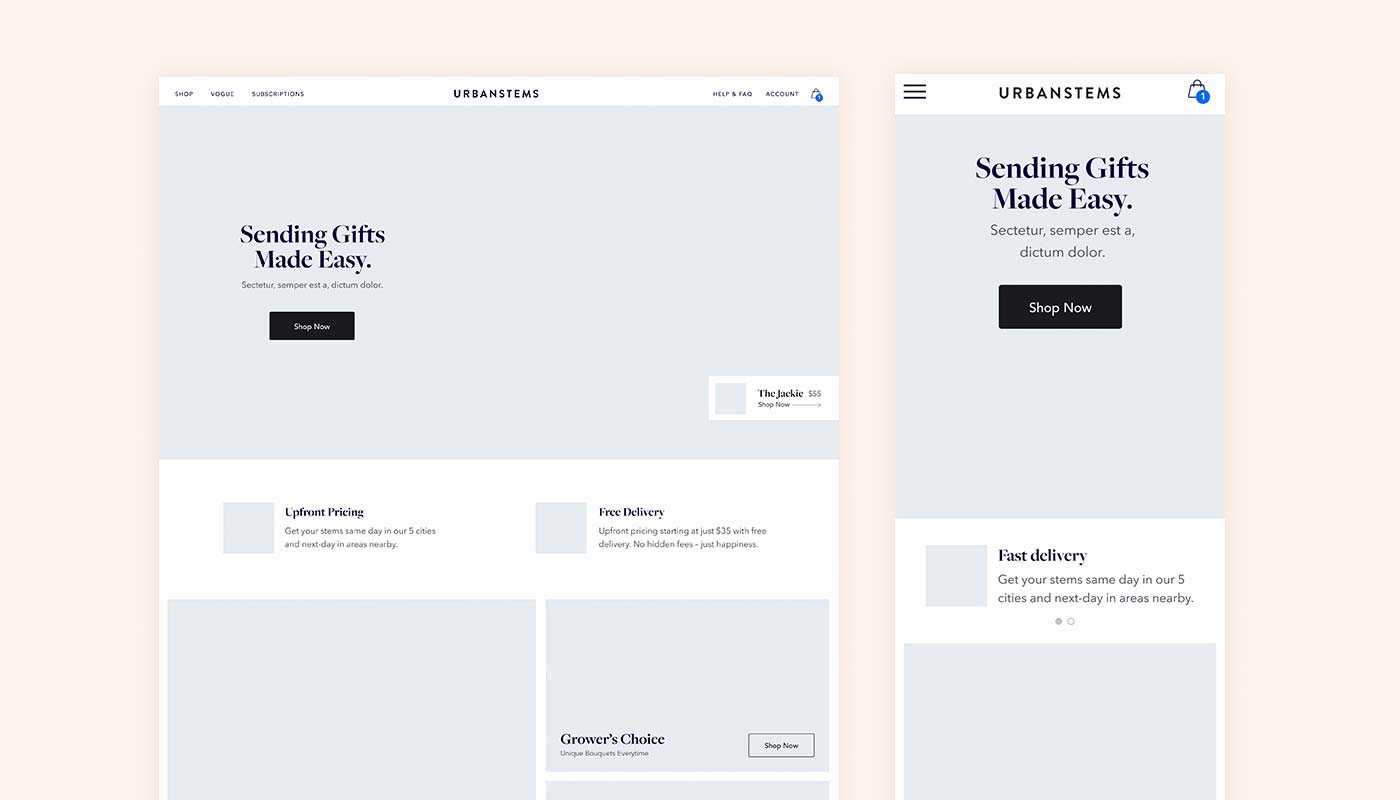
When we started UrbanStems, we saw a big opportunity to improve the experience of sending flowers online. At the time, the market was dominated by traditional ecommerce sites like 1800 flowers, FTD, and Teleflora. Landing one of these sites, customers are faced with a dizzying array of options, get upsold along the way, and find out about hidden charges at the very last step. What starts as a $20 order of roses ends up costing nearly $70 when all is said and done. It just seemed wrong.
Why not offer transparent pricing and be upfront about delivery costs? Why not offer a curated selection to make the choice easier? It was clear that the floral industry was broken, and that the best way of winning customers over was to simply be transparent, while creating a quick and seamless ordering experience. These two ideas worked their way into almost every part of our design process and established a foundation for our user experience.
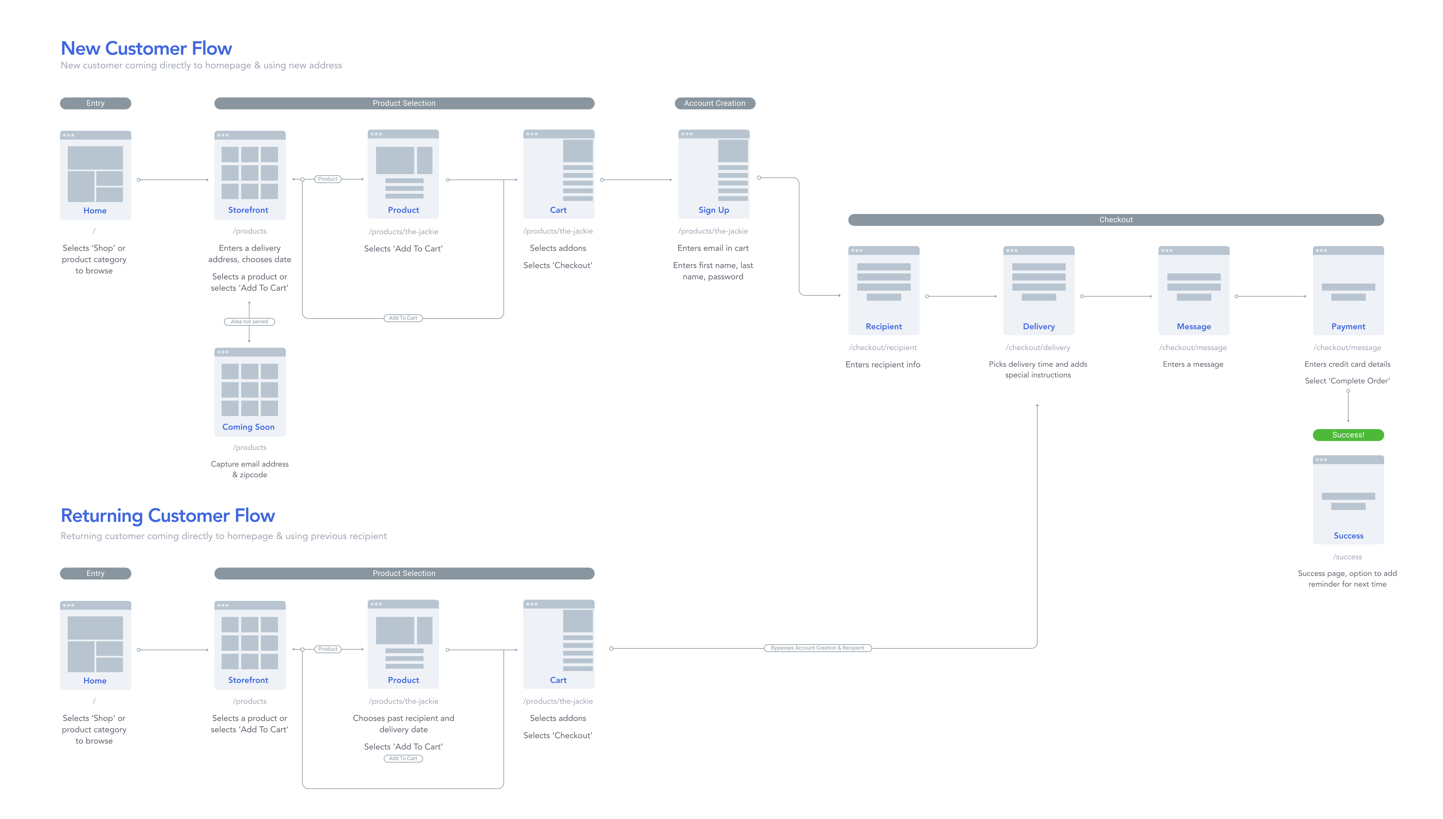
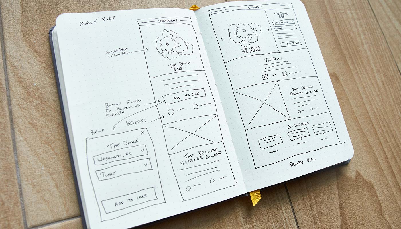
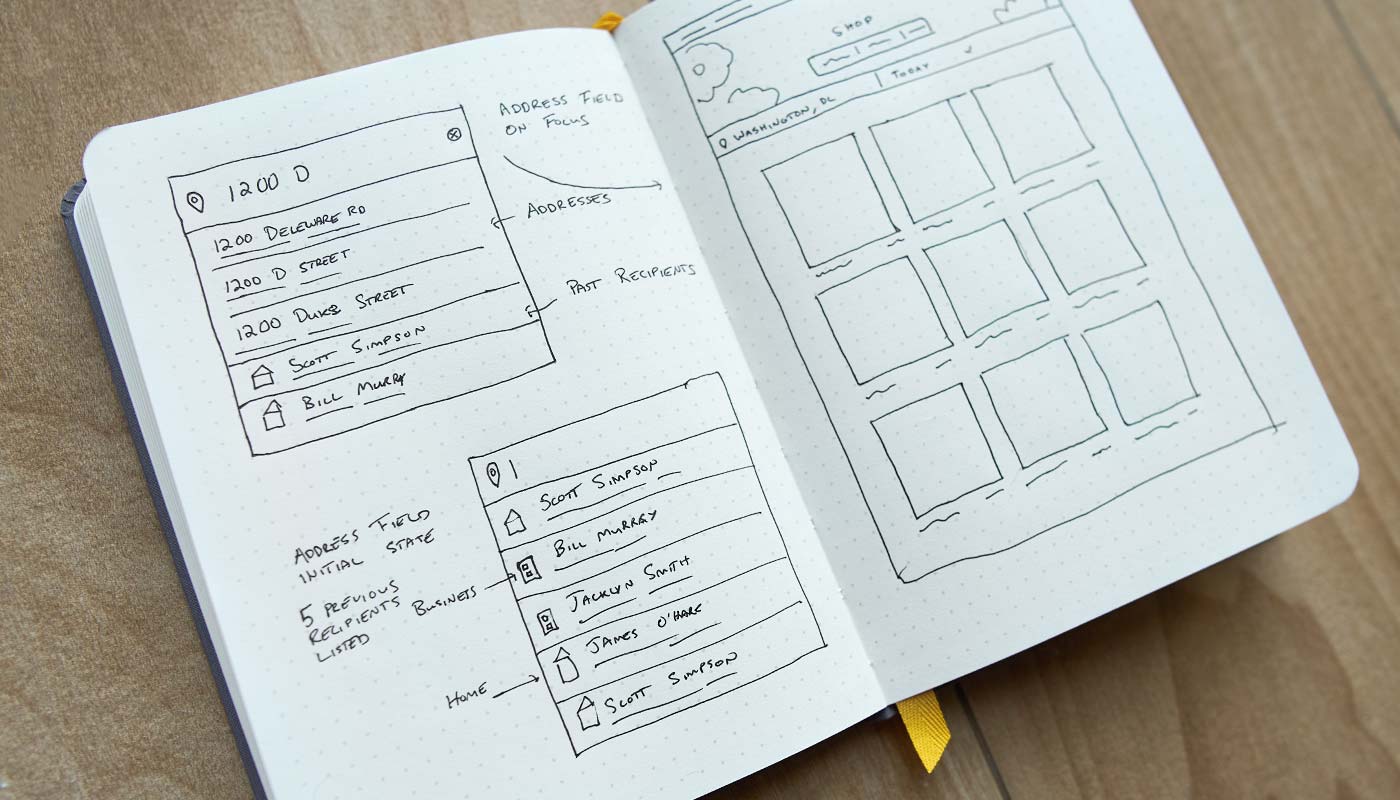
Visualizing The Flow
We quickly identified that our user flow had to be different than other on-demand services. While most other services are focused around sending something to yourself, the majority of our customers want to send flowers as a gift. This comes with a few challenges. Customers don’t always know the address of the recipient they’re sending to and whether or not they’ll be home during the delivery time. I collaborated with different teams, from engineering to operations, to establish this initial outline of our user flow to address some of these issues.
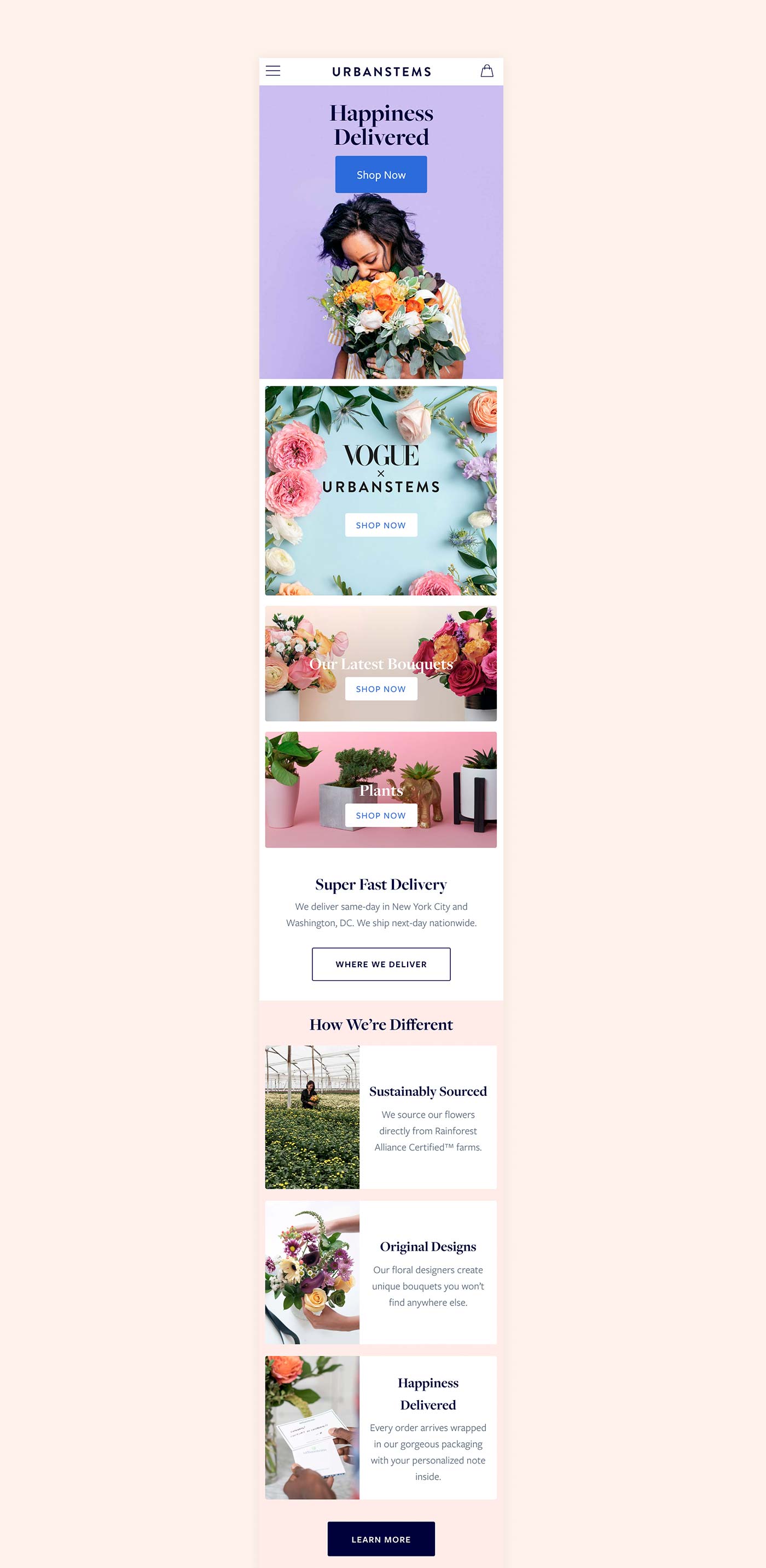
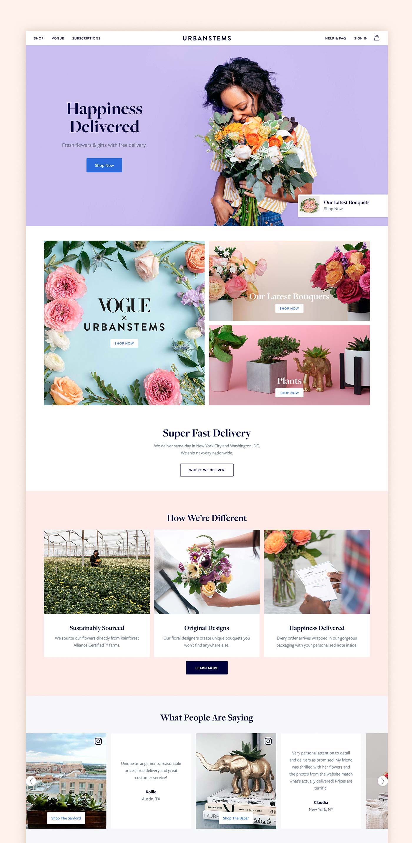
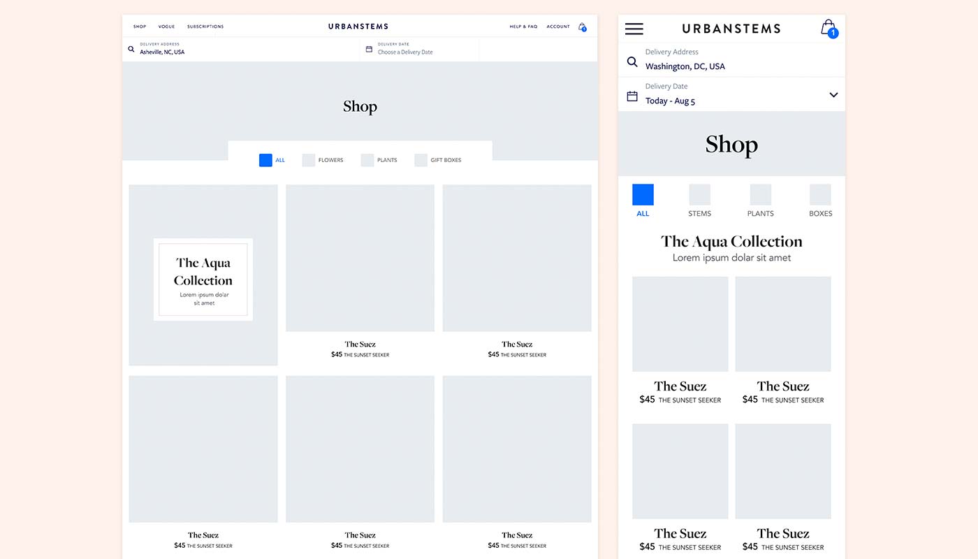
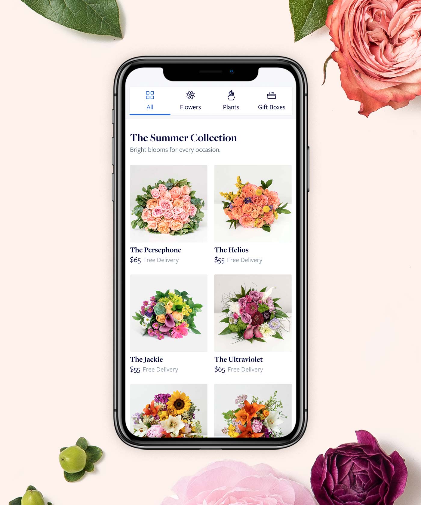
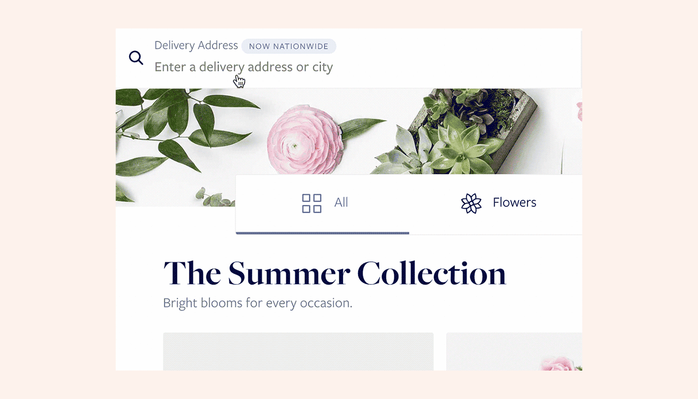
Simplifying The Offering
When customers landed on our storefront, I wanted the selection to be simple and for the page to communicate clearly the quality and variety of the product. I opted to keep all the product on one page in collections rather than divide it up onto multiple storefronts. This would make it easier for the customer to comparison shop and would communicate the different product categories all in one place.
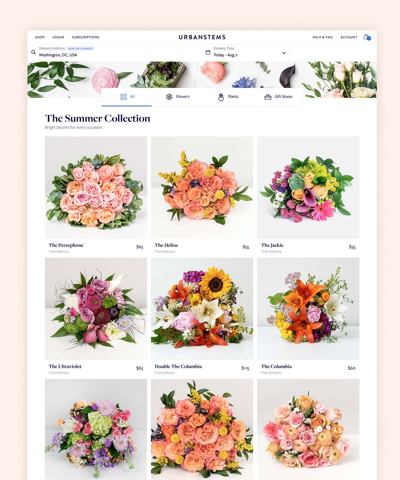
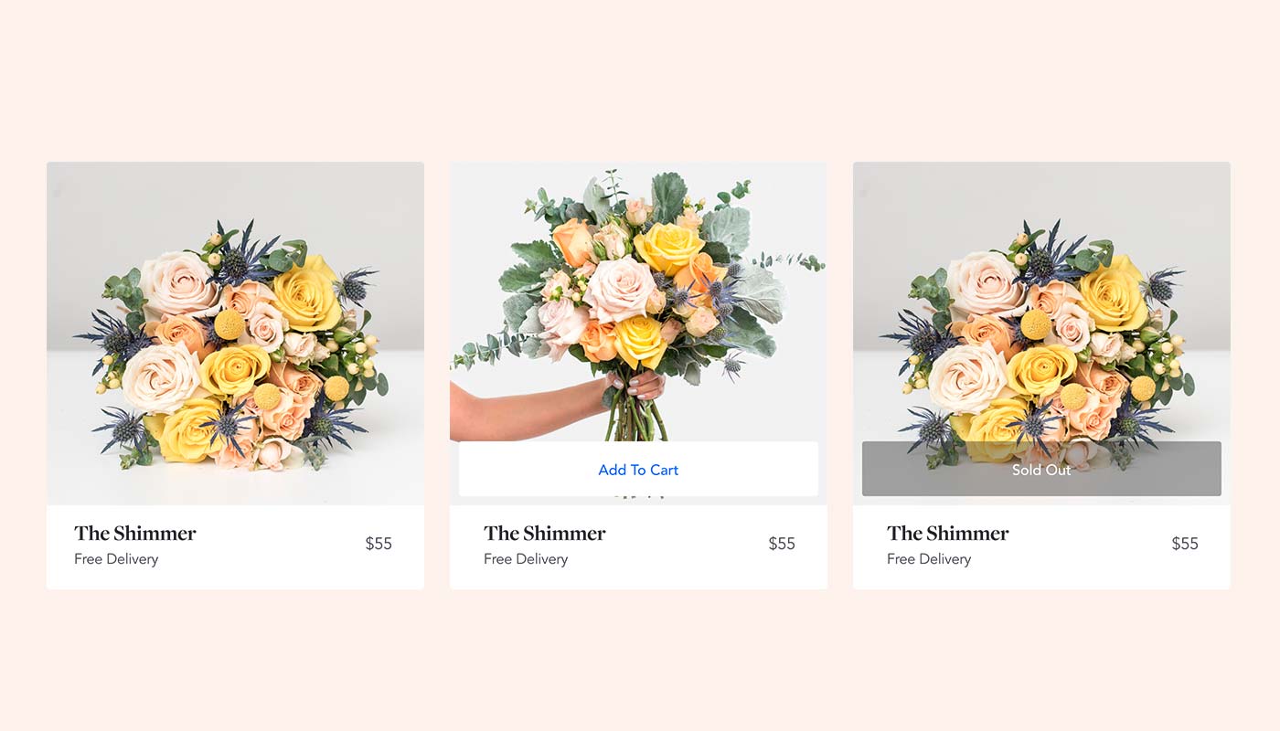
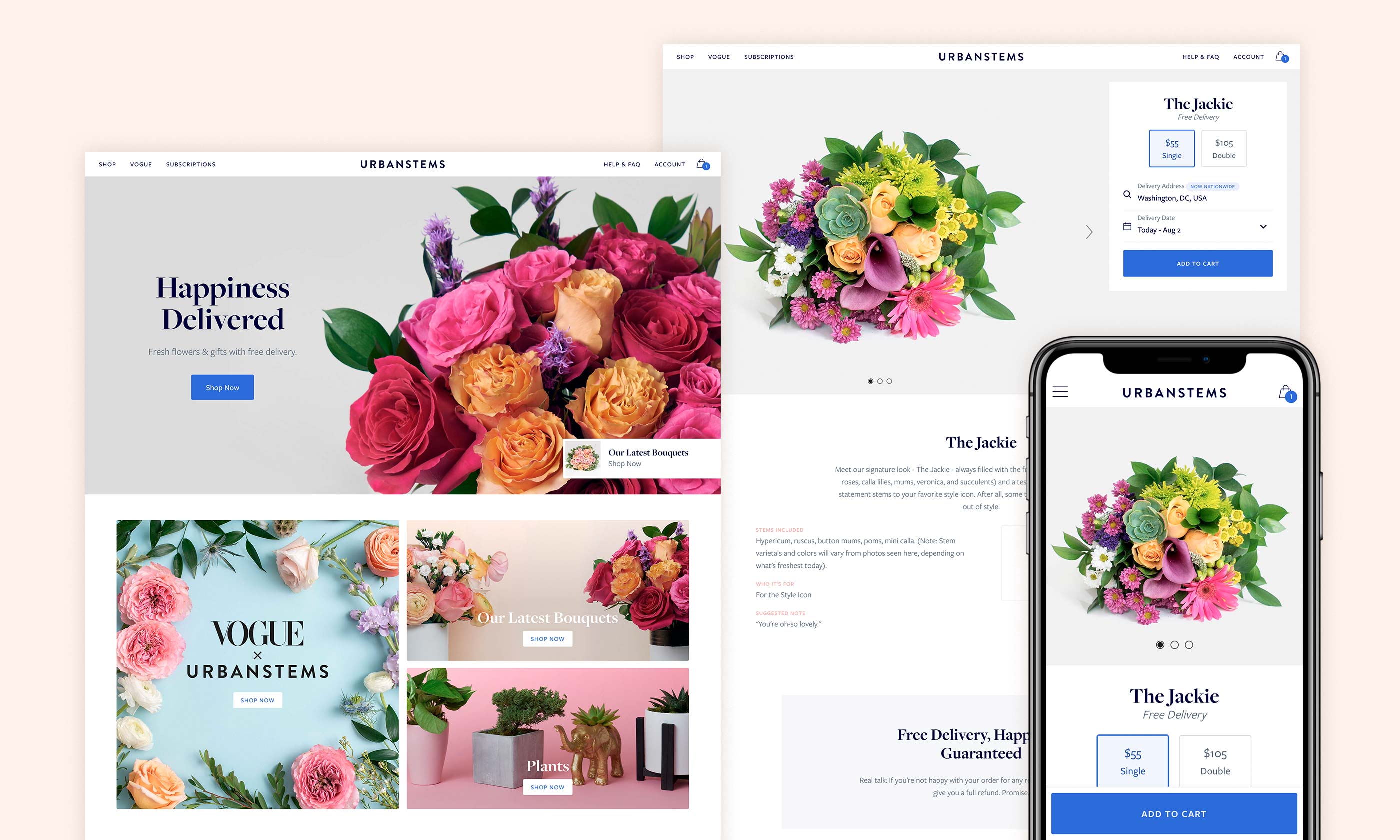
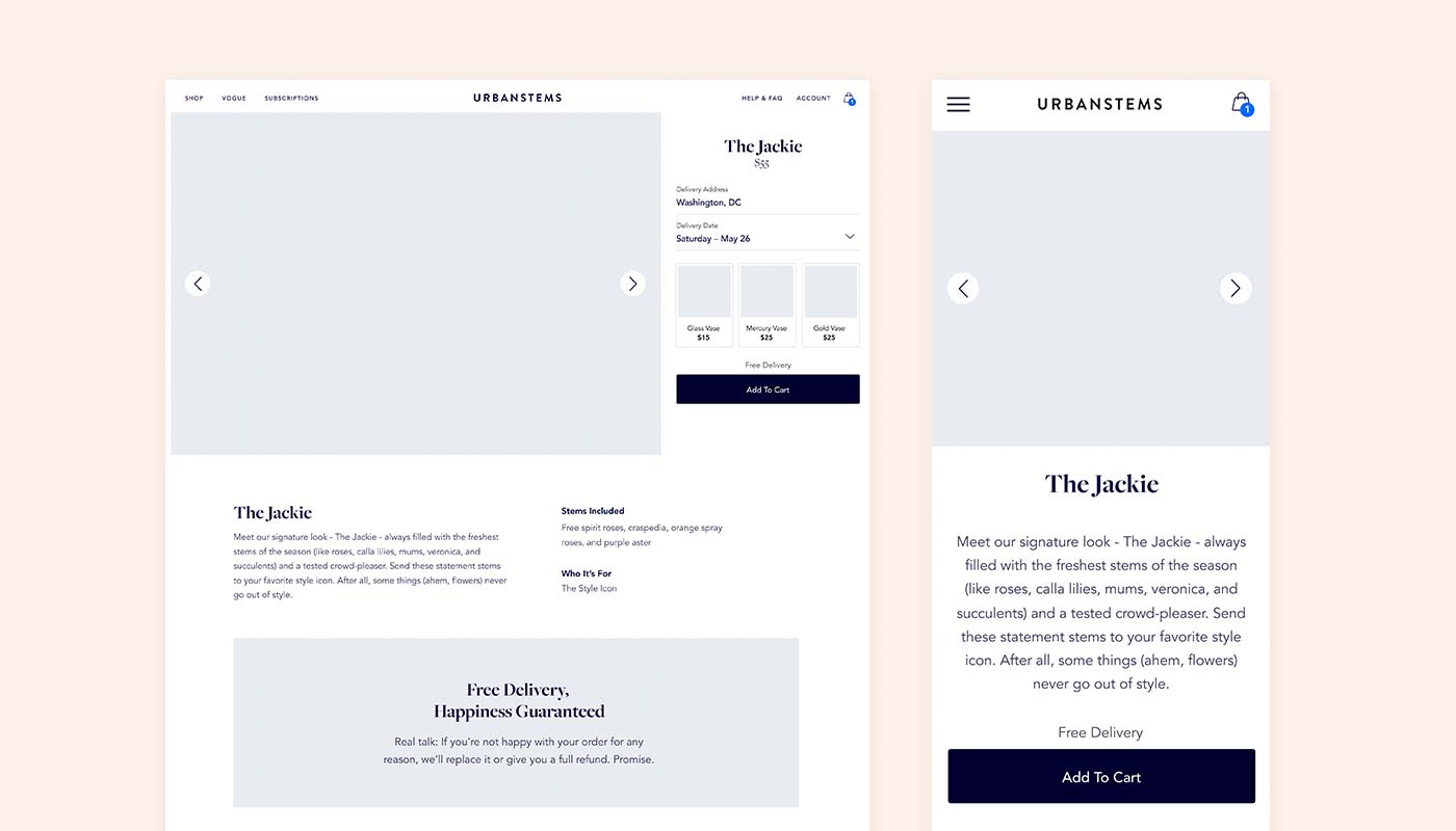
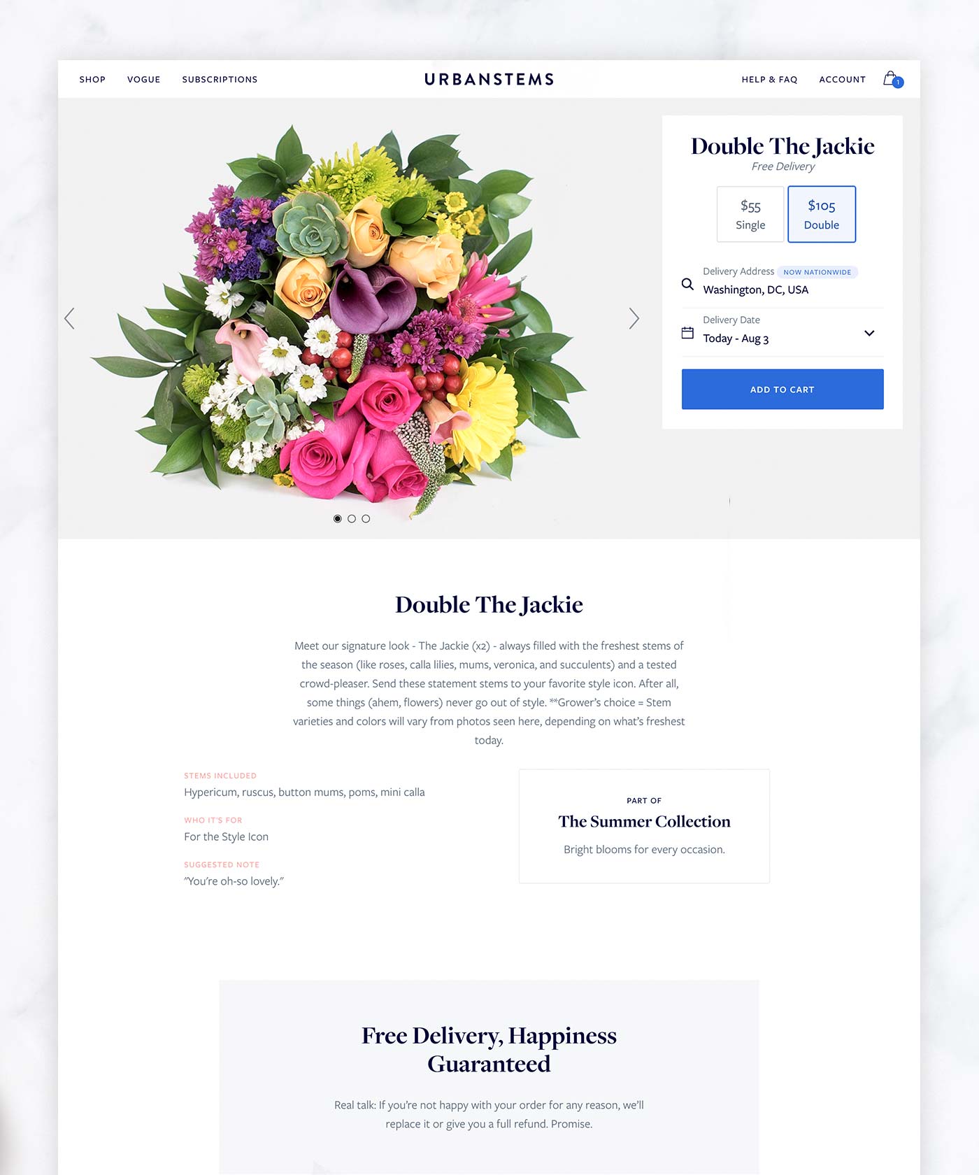
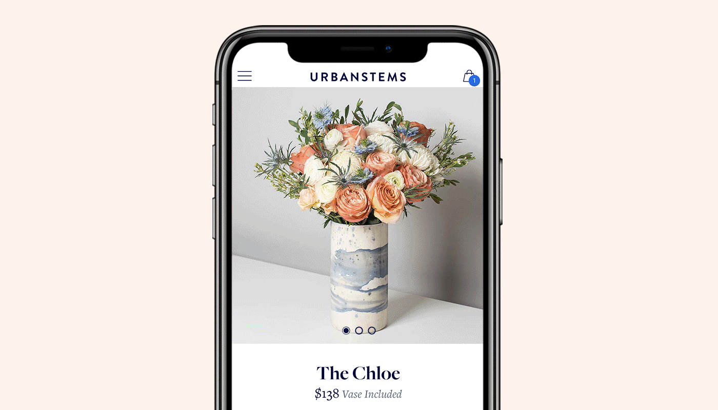
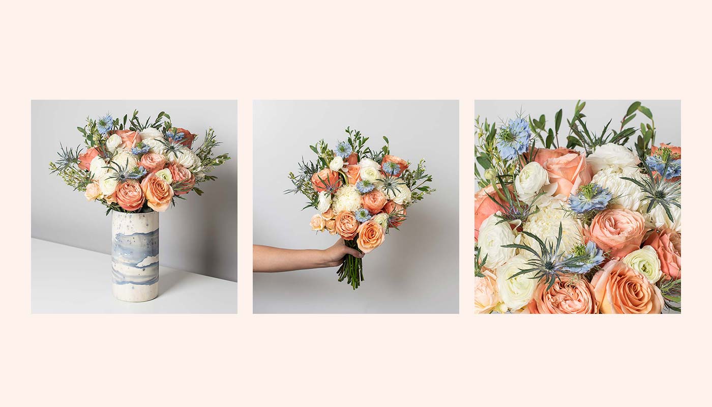
Communicating Quality & Speed
I saw the product page as an opportunity to reinforce the quality of the flowers and the transparency of our offering. I designed the page featuring a large carousel of beautiful product photography. I also collaborated with the marketing team to make the language concise and to highlight our value props as well as our happiness guarantee. Working with our photographer as well as the marketing team, I helped establish a product photography style and system that we used to showcase each product.
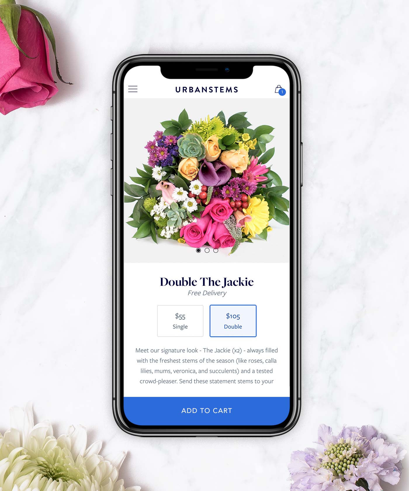
Converting The Customer
In our checkout flow, I decided to reduce distraction by having the customer focus on one step at a time. We broke the process into 4 different parts: recipient, delivery, message and payment. We wanted the process to be easier for returning customers, particularly if they had already sent to a recipient before. We were able to speed up the flow for these customers by bypassing some steps if they had chosen a past recipient.
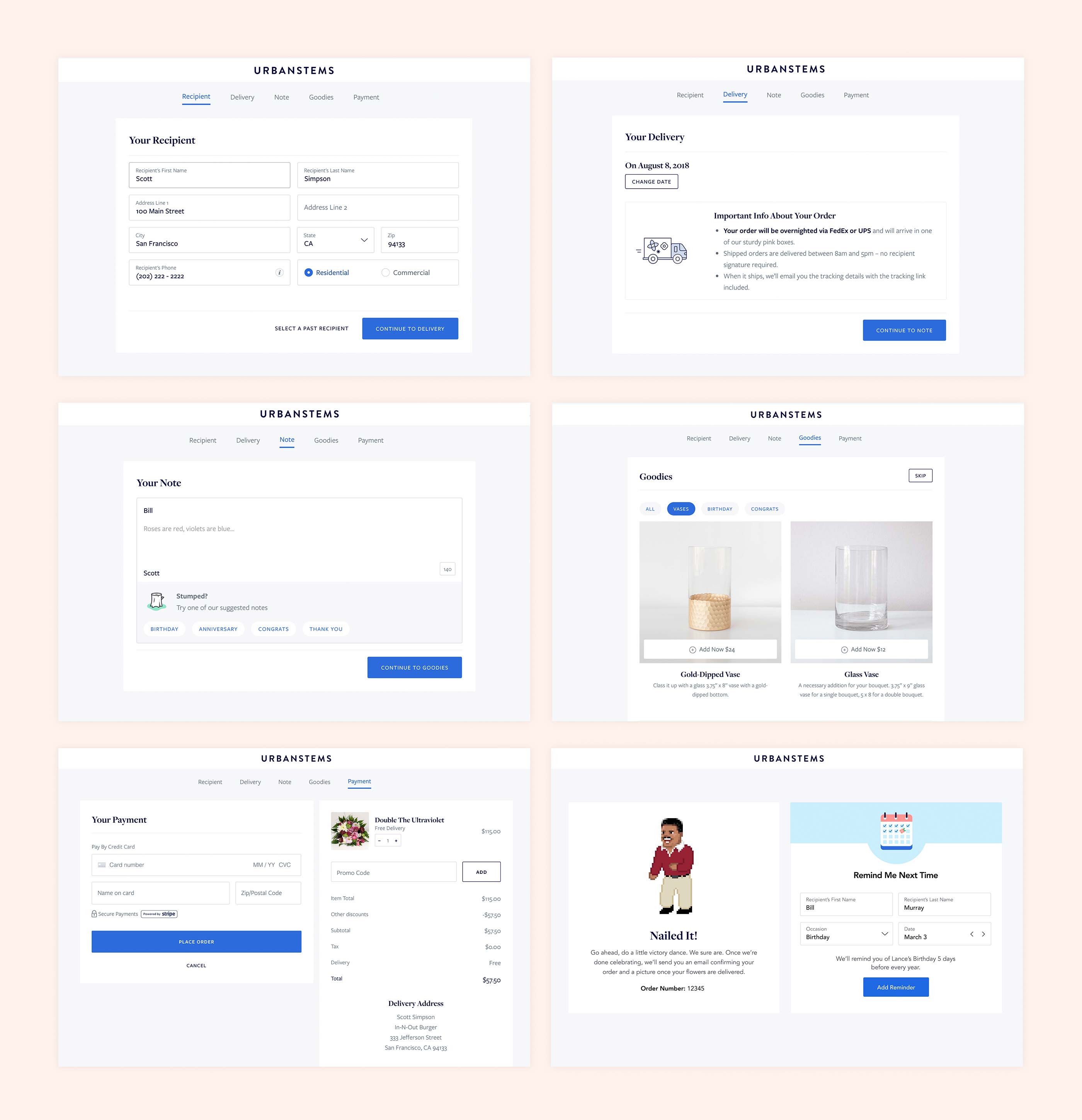
We a/b tested this multiple step checkout flow with a single page checkout to see what converted better. Interestingly, the multiple step flow was more effective and from add to cart through to a completed payment converted at nearly 85%.
Refining With Data
We worked with the business intelligence team to develop a report that would help us iterate on our user experience. This report gave insight into where in the conversion funnel customers were falling off and where best to focus our efforts. It gave us precise data on everything from conversion rates on each step, down to where the user was coming from and what device they were on. This report, combined with user testing, formed the basis for many different iterations and a/b tests of our flow and helped us refine our user experience.