Building a Design System
The challenge was to build and maintain a design system and UI language that would allow a small team to quickly scale our ecommerce business. I created a centralized, React-based component system that both the design and engineering teams use in production
Client
UrbanStems
Role
UI/UX, Frontend
Technology
React, HTML, CSS, JS
The Opportunity
As a small design and engineering team, it was often hard for us to build and iterate on our product quick enough to keep up with the company's growth. Without a single source of truth for our design system, we would find ourselves creating multiple UI components to accomplish the same thing. We would also call these components by different names, often causing confusion between teams. Very quickly, our css library got bloated and was difficult to maintain. It was clear that if we were to be more effective working across teams, we needed a simple system.
Researching The Options
Our team already had a basic component library built out in Figma. We wanted an easy way to translate our Figma components into React components and to visualize them all in one place. There were quite a few options available to us to do this the styling side including Styled Components, CSS Modules, and just plain old CSS. We decided to go with CSS Modules as it would allow us to keep our CSS separate from our JS and give us the flexibility to move between frameworks in the future.
To visualize our component system, we decided to use React Storybook. This library would integrate nicely into our component library and give us a way to show each component and the properties that are available with each one. It would also be easy to keep up to date as our library expands and changes over time.
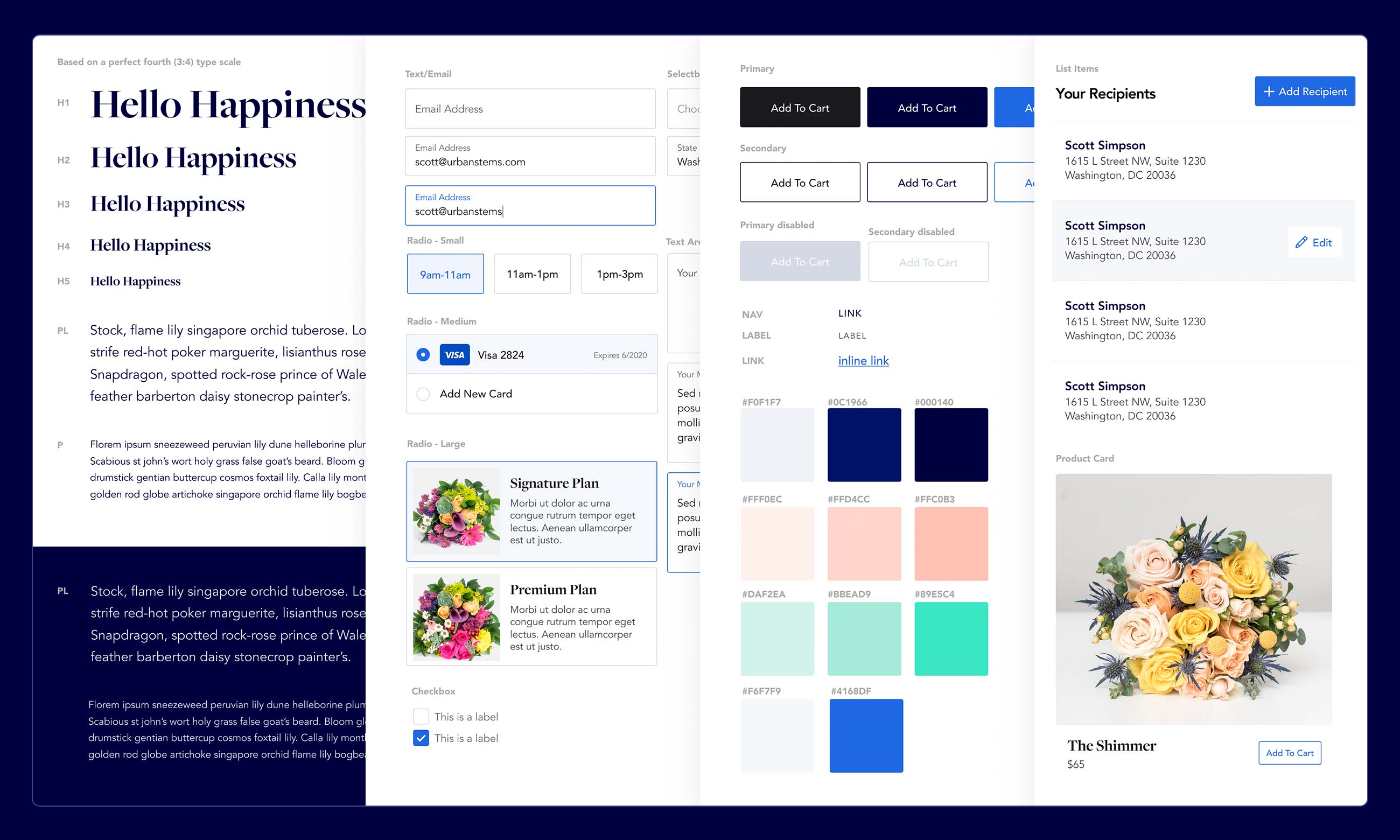
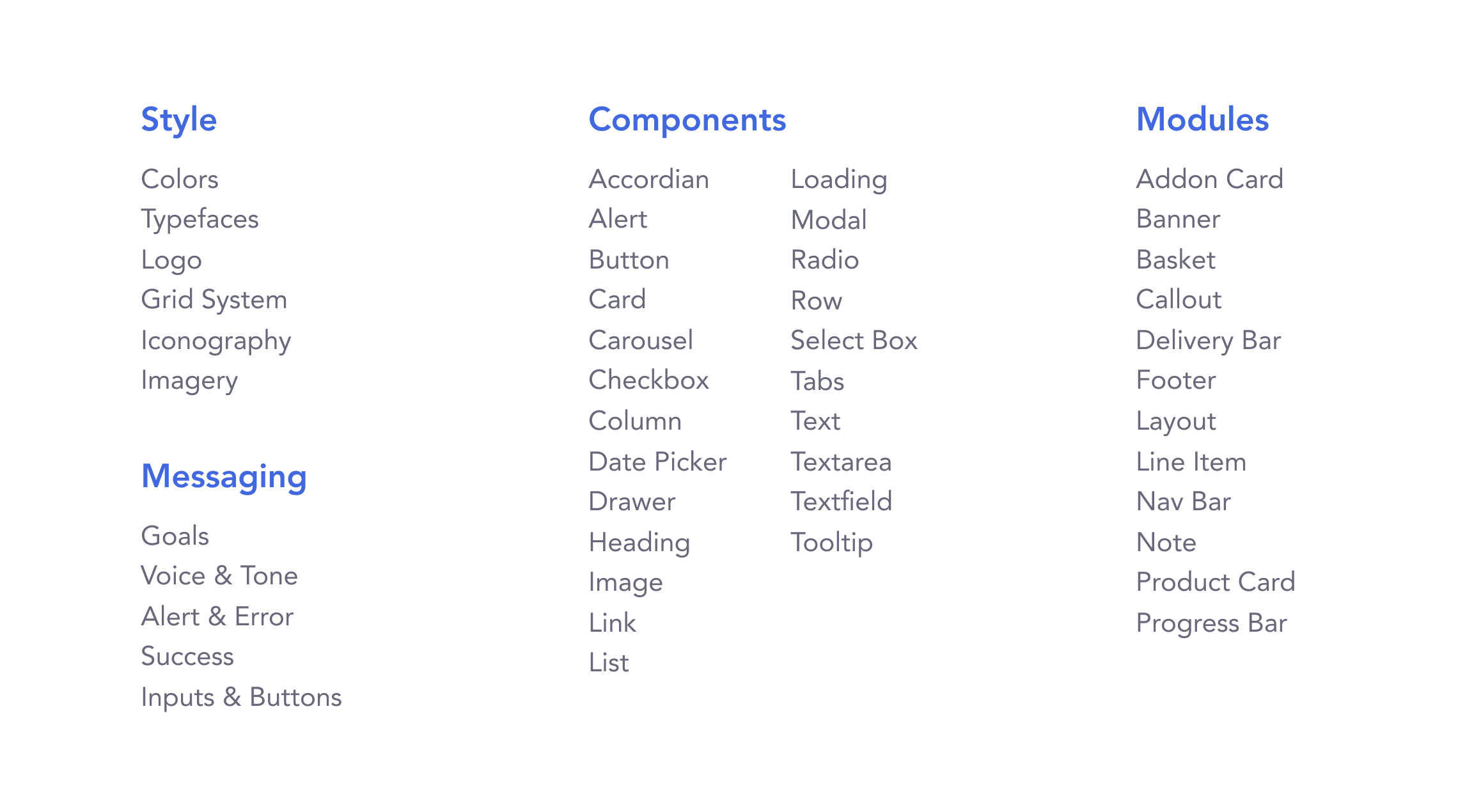
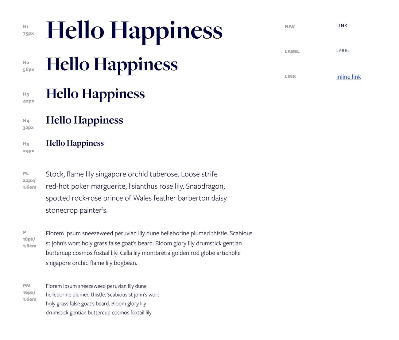
Defining The Components
We started by going through our site and doing an audit of our UI and breaking it down into components. We categorized elements into categories and whether they were individual components or modules. Defining them this way helped to also determine the folder structure on our frontend app. Ideally we wanted the naming conventions in Figma to match with the components used in development.
Starting Small
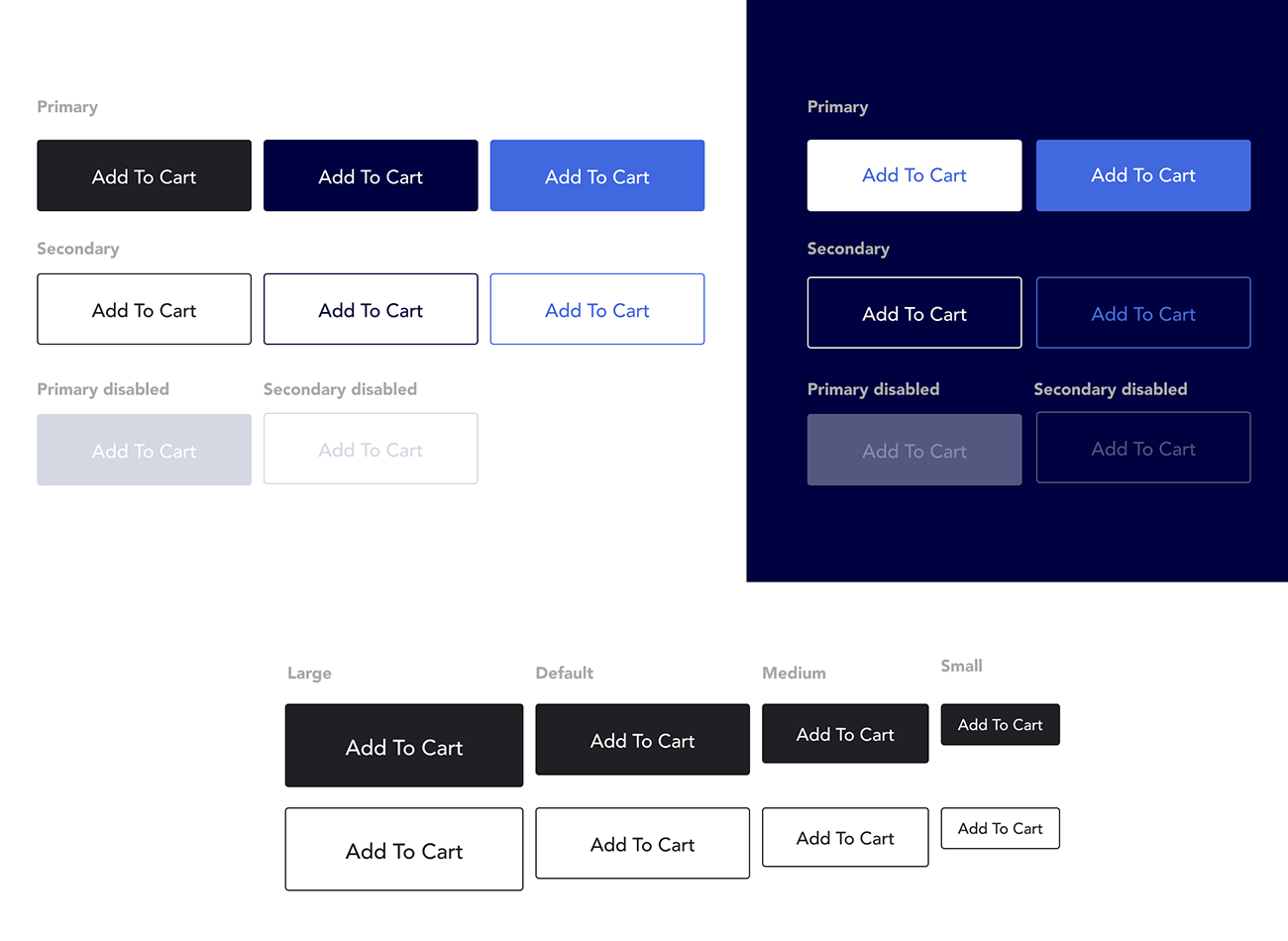
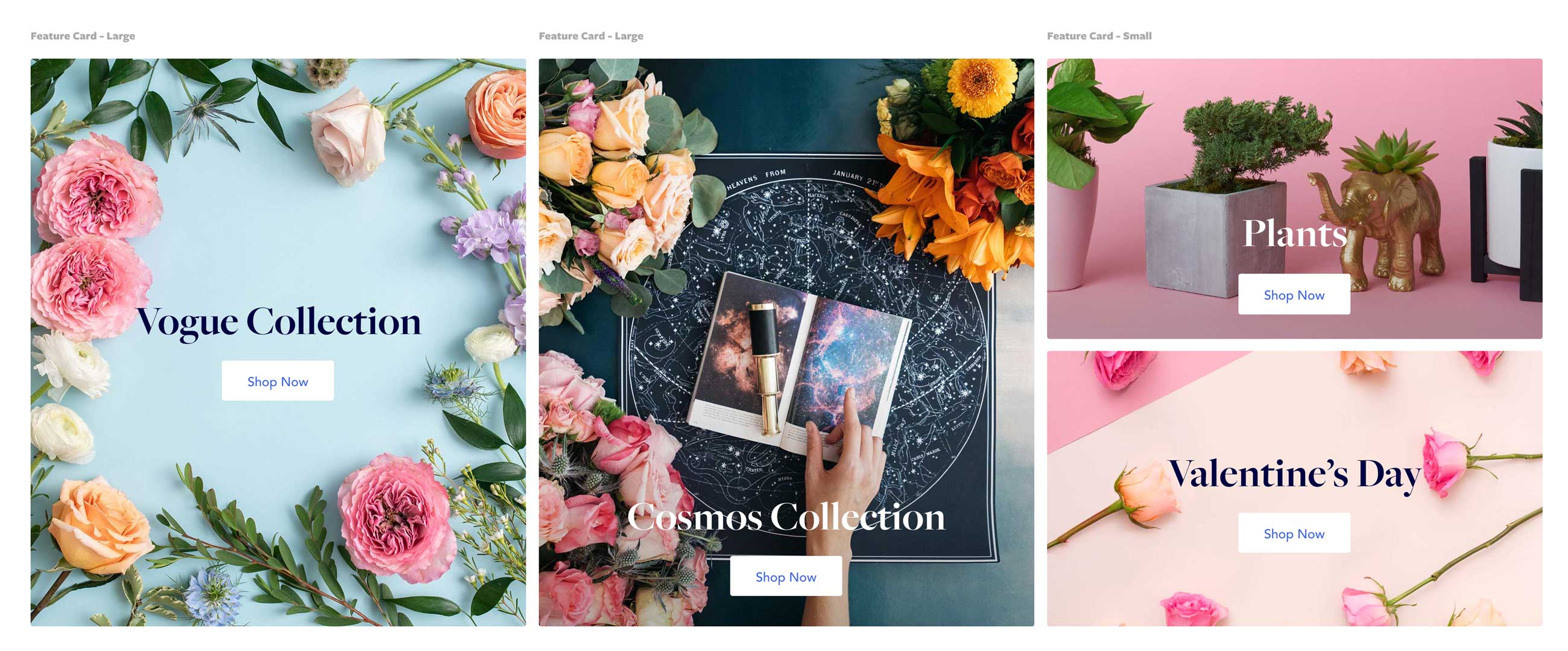
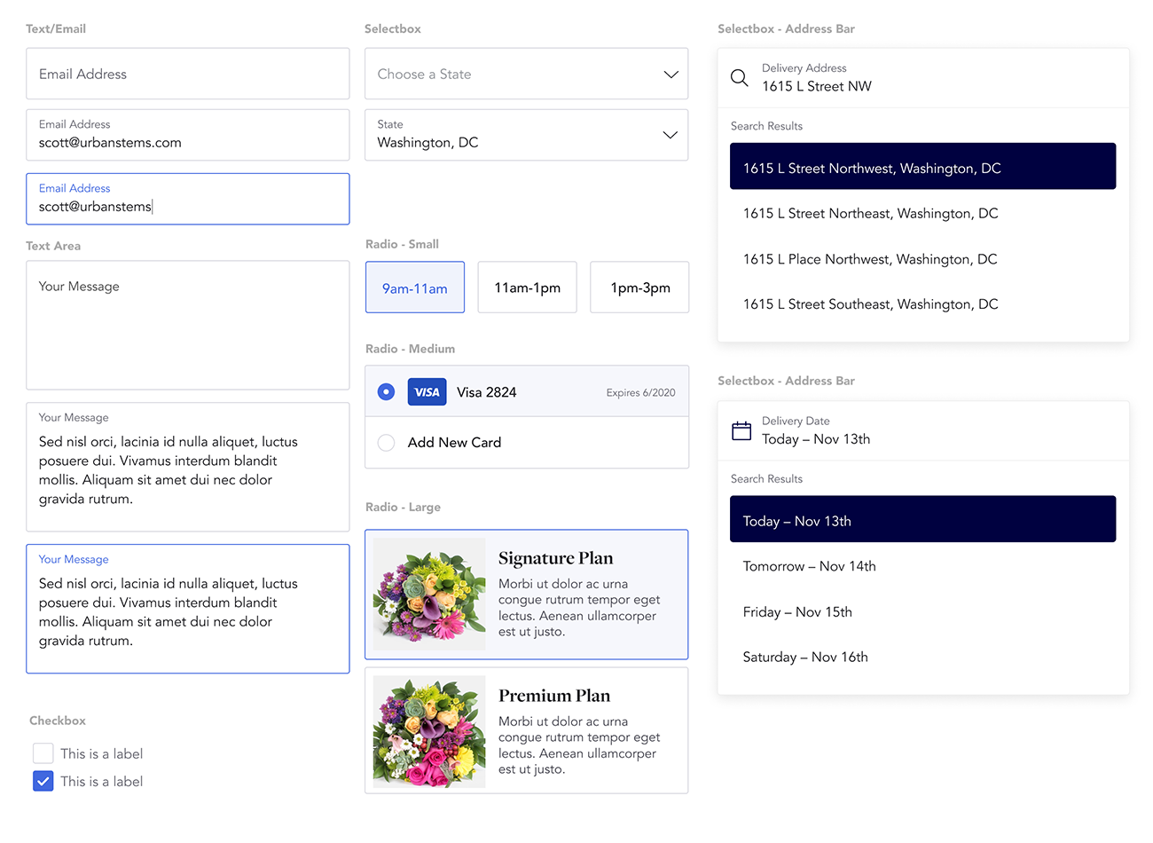
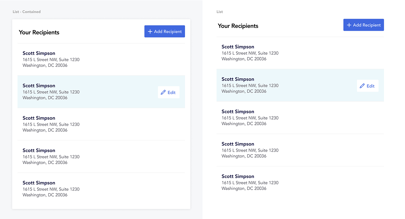
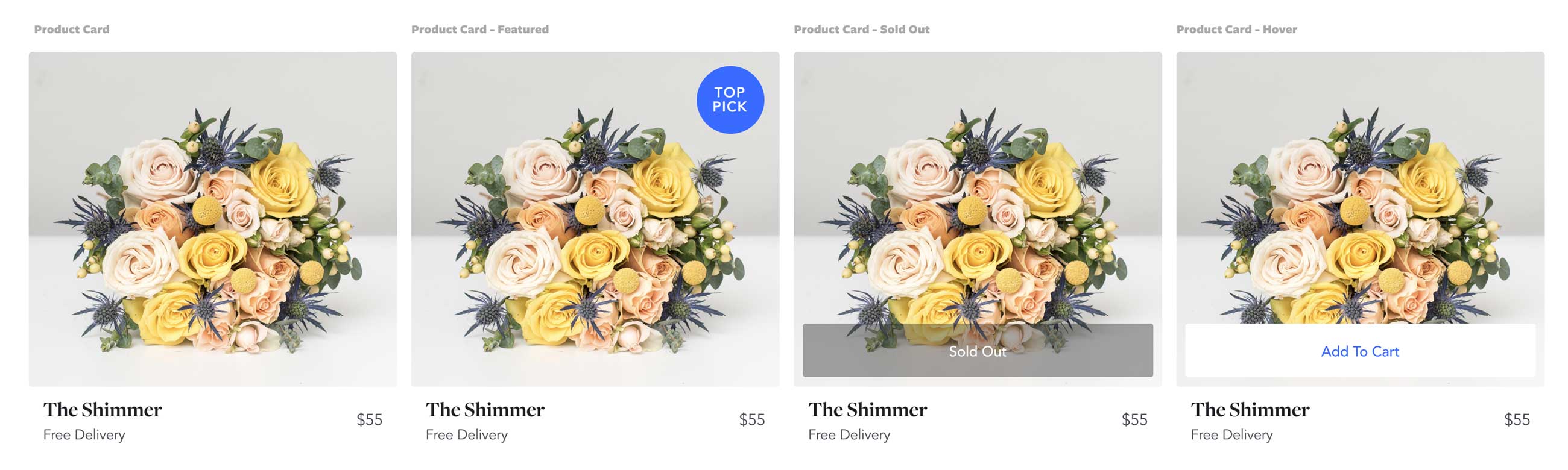
Developing a component library can be a big task, particularly with a small team. I decided the best way to transition our site over to a component based system was piece by piece. I started small with stateless components that were used universally like layout, button and navigation components. I then moved onto form fields and more specialized components like product cards and line items.
We’re still in the process of converting our site over to our new design system. It’s an iterative task that we’re tackling bit by bit.
Maintaining Consistency
One of the biggest advantages that I’ve seen since developing our design system is that things feel more consistent on our site. Whereas before we had multiple styles for form fields, everything now feels uniform. It gives the team more of a chance to focus on the user experience and building new features rather than getting bogged down in small design details. It also means that when we want to make a change to our system we really are forced to think about the effect it will have on other components within the system.